Showing posts with label work diary. Show all posts

Wednesday, 10 December 2014

Contrast location 2 - work diary

Contrast location 2 - Work diary:

In this session we was given the task to re-shoot contrast on location. I found this session to be be quite boring and found myself repeating images from my previous contrast location shoot. While shooting this topic I attempted to find some more original and different shoots than I had already taken, I found that while I had taken a few shots that were different these were limited as I was trying to not repeat the same shots. After shooting the topic of contrast twice now I have decided that I have finished with the topic and don't feel that I need to shoot it again.


The two pictures above and below are two of my examples of contrast. The image above shows a clear contrast between colours as well as the tiles and the grass. I have chosen this picture because I like the clear use of colour in this image as well as the clear difference between the two. I have chosen the image below because of the clear difference between the bricks and the stones, this contrast is a different contrast to any that I have photographed before as I have focused on something else other than colour. I think that this is a clear example of the different types of contrasts that can be photographed.


I have included these two pictures from the internet to show contrast on location. The image above is a clear contrast between colours as well as the grass with the soil. I have included this image to show how contrast can be found with all different settings and with natural elements. I have included the picture below because it shows a contrast between something that is natural and something that is man made.


Tuesday, 9 December 2014

contrast location 1 - work diary

Contrast location - work diary:

In this session we were shooting contrast while on location. I enjoyed this topic as i found it easy to find different contrasts while walking around campus. I found myself taking a large number of images as well as having a variety of different contrasts. I also found myself thinking of more original contrasts meaning that i didn't find myself getting bored. I wouldn't re do this topic as i was happy with the work that i had produced, and found that i had enough without needing to re shoot. I think that in this session some of my best images were produced as i found my self coming up with original ideas as well as ideas that fit the topic. 


These two pictures are two of my examples of contrast. The picture above is showing a contrast in the sky that was completely natural. I think that this is one of my best pictures for showing contrast because it is completely different to any of the other pictures that i had taken. I also like how natural the contrast is and that the picture has been left without to much editing. The picture below is a more common contrast as it is a contrast between the colour of two sets of bricks. I have chosen to include this picture because i think that it shows that although it is a common contrast it is still a very clear and one of my best ways of showing contrast in photography. It also shows how simple a contrast can be and doesn't have to be over complicated.


In these two images contrast is being shown. I have chosen the first image because of the similarity between it and  my image of the sky. I have included this to show what I based my idea off of. I have also included this to show how its a natural occurrence as its not something that i have thought of my self. i have also chosen this picture to show that contrasts don't always rely on a personal touch as well as something growing, in the case i was lucky to take my picture when i did as i would not always be able to find a sky like that. I have chosen the picture below because it shows how clear a contrast can be even if it is not natural. This is clear as you can tell that someone has placed the shoes on the grass. In this image the contrast can clearly be the difference in the colours as well as the idea of something man made being placed on a natural setting.


Monday, 8 December 2014

Mapplethorpe location - Work diary

Mapplethorpe Location:


In this session we was shooting in the style of Mapplethorpe while on location. I found this task to be more difficult than when shooting in the style of Mapplethorpe in the studio. I found that this time around I had to focus more on the composition as well as focusing more on my background and making sure that I was happy with it. Once I had got into the style of this shoot, I found myself enjoying it more as well as being happy with the pictures that i was producing. If I could re shoot this topic I would try to shoot more of a variety of pictures instead of them being quite similar.


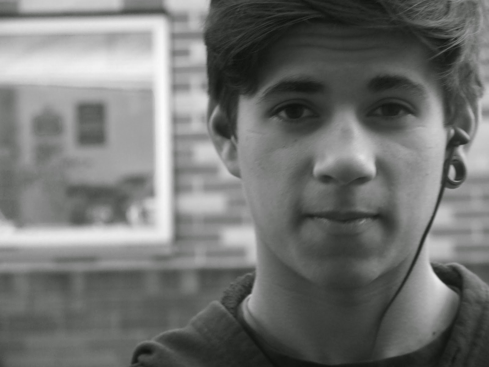
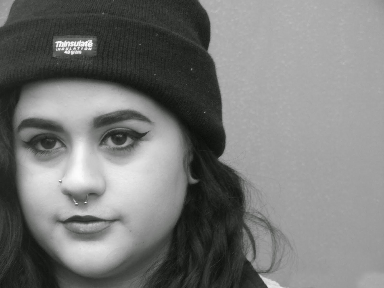
These are two pictures from my Mapplethorpe location shoot. I have chosen these to because I think that these are two of my best for showing the style of Mapplethorpe. I these photos i have stuck to the typical idea of Mapplethorpe's shoots by sticking to the idea of having a plain background as well as have the face at one side of the frame. I have also stuck to his structure by turning the picture black and white after.


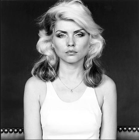
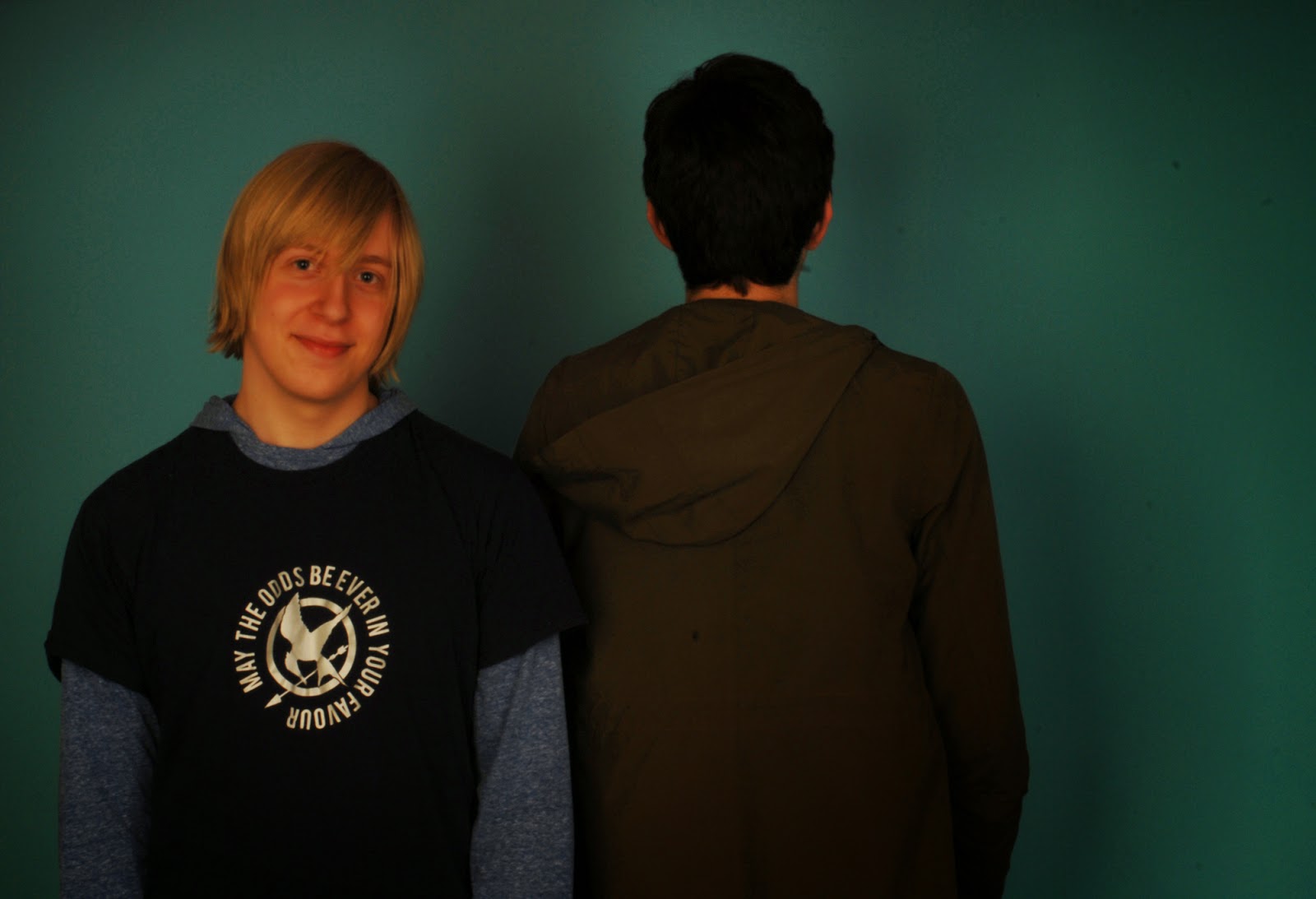
The two picture below are examples of Mapplethorpe's portraits. Most of his portraits are done in the studio, however you can see his idea being used on location. In these pictures Mapplethorpe has kept the person in the middle of the frame as well as keeping a serious mood to the photo. This is the main idea that I have tried to include in my images.


Thursday, 4 December 2014

Mapplethorpe studio - work diary

Mapplethorpe studio - work diary:

In today's session we were again in the studio, we were shooting portraits in the style of the American photographer Robert Mapplethorpe. I enjoyed this session as I enjoyed positioning my class mates and having complete control of how I wanted my image to look.  If i could re do this topic I would try to think about some of the more creative Mapplethorpe shoots and try to think of a way to incorporate some of it into my work.


Above and below are an example of some of the images I produced in my studio Mapplethorpe shoot. I like these images because I like the use of black and white as well as the composition. I like the picture above because I like the way that Lauren is looking over her shoulder in to the camera. I also like how there is nothing else around her and you can't see her whole body. I like the picture below because I like how the photo was taken while Chloe wasn't looking. I like how this photo seems less serious that the one above and I think they both demonstrate Mapplethorpe's style.


Below are two examples of Mapplethorpe's portraits, I have chosen these because they are both completely different. The first one in more serious has there has been a strong use of composition. I also like how the model is not looking at the camera which gives a deeper meaning to the photo. I like the second picture because I think it is a more relaxed and fun picture. I also like how the model is not in the middle of the frame and is in the end, he is hear proving that you don't always need to be in the middle of the frame.


Work diary - Multiple imagery

Multiple imagery - work diary 


In today's session we was shooting images for a multiple imagery, I found this session quite boring because I did not enjoy the fact that we had to take multiple pictures of essentially the same thing. However I did like the finished picture once the Images had been produced. I think that this is a good way of showing multiple images of a similar topic without having to look at these images singularly, I also think this is a good style to use to create a variety of images as well as to have freedom to decide what is included in the overall picture if i could do this topic again i would try to think of more interesting pictures to take so that my end images have more variety.


Below are my multiple imagery's, I think that they clearly show the concept of multiple imagery. I have included one image that shows a series of images that are very similar and are actually of the same bush. I like the way that this multiple image shows the different parts or a bush without having to look at another generic picture of a bush. I think that my second multiple imagery is my best of what i produced. In this picture the theme is shoes so in this picture there are multiple different images of shoes. I like this image because it shows how a multiple imagery can work when there is a running theme but the pictures are different.


These pictures that I have found from the Internet are all examples of multiple imagery.
The two are showing to completely different objects but have both chosen to photograph that object from different angles. This is a more creative way of show an object from all angles without having to look at multiple images, its also more creative as it allows for a different style of photography so that you don't always have to stick to the same style.


Work diary - Studio contrast 2

Work diary studio contrast 2:

In today's session we were in the studio shooting contrast again. The second time around I found myself improving the quality of my images and thinking more about the contrasts and the composition. However I found myself running out of ideas quite quickly and then saw myself retaking images that I had I already taken in the previous session. If I could re do this topic i would spend more time thinking about what the contrasts are in my images so that I don't end up repeating what I am shooting.


I have included the picture above because I think it is an example of a common contrast as this is a contrast between clothes. I think this image shows the clear differences in the clothing that the 3 people are wearing, however I don't think that this is a good image for contrast as I don't think they are as clear as they should be. I don't think that when a person saw this picture they would think that it isn showing contrast.


I have chosen this image because I think the clear contrast between the shoe laces. This picture is not always something that you would see as most people would commonly wear laces of the same colour. If I was to re take this picture would try to think more carefully about the composition. 


I have chosen this image from the internet because it shows how contrast can happen when someone has altered some objects to create a contrast. I also like how strong the colour contrast is. From looking at this image I will try to use the idea of strong colours to improve my work further.


I have chosen this image from the internet to how how a contrast can happen naturally and is not always man made. This picture has made me want to think about contrasts more and look for contrasts that I see while being out.

Walk two - Work diary

Walk two - work diary:

In today's session we went on another walk on a similar route to the first walk. This time I often found myself taking pretty much the same pictures as last time, however I did try to find some scenery that I hadn't previously found. I also found myself focusing more on journey and back of heads as these two topics I had neglected in the previous walk. If I could go on another walk I would try to look for scene and possible pictures that were completely different to what I have already taken, this way I would end up with a large variety of images.


I have chosen the image above as one of my best pictures to show journey. I think that this picture is an original idea that is not also thought about with journey, but can often represent journey. I also like the angle that I took this photo and how it looks on the finished edit.


I have chosen the image above to show autumn colours. I chose this picture because I like that there is multiple autumn colours in on leaf. I also like how the leaf is in a clear focus while the background is more blurred showing that it is less important to this image.


I have chosen this image from the internet because this is something that I would like to aim to photograph if I could re do this shoot. I like this picture because I like how the red is a strong colour in this image, I like how the red is not common in a lot of images but in this particular image the redid the main focus.


I have chosen this picture from the internet because I like how clear the compostion is, I also like how the light is so clear in at the end. I have included this picture because think it can help me to learn about compostion and I hope that I can produce clear images like this.  


Monday, 1 December 2014

Work diary - Walk one

Work diary - Walk one:

In this session the whole class went off campus and on a walk, we was told to photograph, autumn colour, back of heads and journey. Personally I found that autumn colour was the easiest for me to photograph as I felt that I could find things that completely full in with the theme. Some of the pictures that I was proud of was for the theme of journey as I think that I found some interesting shots but I still think that I could improve from these. In this walk I found myself neglecting the theme of back of head and found that I missed some good opportunities for some interesting shots of back of heads. In the next walk I will try to improve on some of the pictures I have already taken and and try to develop the quality further and I would also focus more on back of heads so I end up with more shots.


I think that the picture above is one of my best pictures from the walk as I think that it clearly shows autumn colours. I also like this picture because I like how natural the leaf sits in the photo with the background around it.


I think that this picture is one of my best for showing journey during my walk. I like that this picture has a clear light at the end so it is very clear where the end is and where Alex is travelling to. I also like that in this photo Alex isn't very clear meaning he is not the main focus of the picture but it still contributing to the journey.


I have chosen these two pictures from the internet to show how autumn colours and journey can be shown in one image. In the two pictures that i have chosen the autumn colours helps add to the journey that is being shown. Also in these two pictures a different way of showing journey has been used, in the first the journey is being shown looking up into the sky, while in the bottom the journey is being shown straight on and then carry's on into the distance following a path.


Wednesday, 5 November 2014

Work diary - studio contrast


Work diary - Contrast:

In this session our task was to go into the studio in groups and shoot different contrasts that we could show with people. I personally enjoyed this task as I enjoyed getting to work in a group as I found it made the task more chilled and allowed us to work together to think of ideas. However I also found this task slightly difficult as I didn't want to copy all the same ideas as everyone in my group which meant that I didn't find myself with enough pictures to work with at the end of the session. From this I have decided that I will re-shoot this topic so that I can improve some of my images as well as giving myself more to work with.


I think that the picture above and the picture below are my best pictures as I like that in both pictures I have been able to photograph to kinds of contrasts. In the top picture I have show the the contrast between Dylan and Frankie's height, as well as showing the contrast between boy and girl. Another thing I like about this picture is that both of these contrast show quite obvious contrasts. Also while editing this picture I noticed that Frankie is looking at the camera while Dylan is not, I think that this is a unintentional contrast that has occurred while I was taking the picture.


I think that this picture is also one of my best as again it shows to different types of contrast in one photo. In this picture there is a contrast of facing to different ways as well as the contrast of the different hair colours. I like this picture as I think its effective at showing how simple contrasts can be in photography.


I have chosen these two pictures from the internet as I think that they show two of the most common types of contrasts that can show how effective the contrasts can be. The top picture shows the simple black and white contrast can be and still have a big impact on the way the image is shown. The picture below shows how colour in contrast can help to highlight different aspects of the image as well as let them blend in to the picture.


Thursday, 23 October 2014

Work diary - Back of head portraiture location


Work diary - Back of head portraiture location:


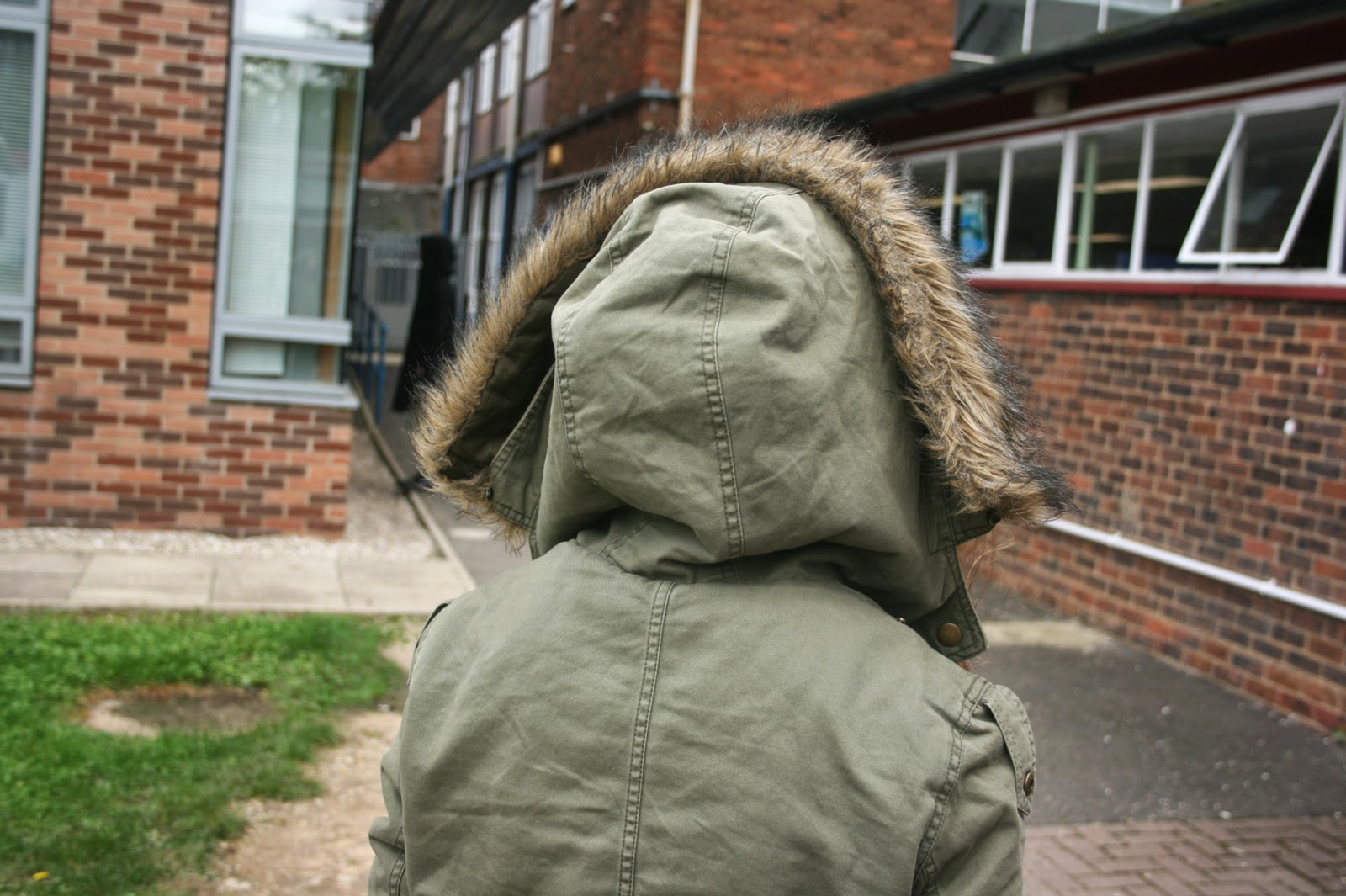
In this session our topic was back of head portraiture, our task was to photograph the backs of people heads with a slightly blurred background. the point of this was for us to learn about the angles and composition of things in our pictures. This will be useful for when we shoot front of head portraiture as we will be able to think about composition when taking the picture and will be able to think where we position the eyes in the photo. if I could do this topic again I would think of more creative places to take my pictures so that my backgrounds are not always the same, I would also try to think of more original ways  to position and photography the backs of peoples heads.


The pictures below are what  feel are my best pictures. I like the picture above as I think that it look natural and unposed, I also like how the person is not in the middle of the picture but it is still clear that they are the main focus for the picture. I think like the picture below as I think that its original and is a different way of photographing the backs of peoples heads so that all the pictures don't look the same. I think that both of these pictures could be improved by making the backgrounds clearer or empty so that theres not a busy background going on behind the photo.


I have chosen to use these pictures to show the different ways of photographing back of head portraiture. The image above shows the back of someones head with quite a busy background for you to also focus on. I think that this allows the image to portray and deeper meaning and get across a emotion. The picture below is just of the back of the head with a plain background so there is less to focus on in the image. this allows for the picture to just focus on the back of the persons head.


Thursday, 16 October 2014

Work diary - shape


Work diary - shape:

In this session our topic was shape, we had to go out and take pictures of anything that involved shape. Personally I found that this task was quite repetitive as I found most of my images being very similar as well as some of them showing the same style of shape. If i could do this task again I would try to find more original ways of showing shape in my images whether this is by the angles I take my pictures from or they shapes that I choose to include in my pictures.

Below are two images that I think best show my way of showing shape in a image. I personally like the first picture because I like the way that the focus is on the flower which is helpful to show the outline of the flower which shows the initial shape of the flower.


I think that the photo below is a more subtle way of showing shape. I think that this photo shows how shape can be in everyday surroundings. This picture also shows how multiple of the same shape and different shapes can make up one over all shape. The way that the different tiles in this pictures make up one shape makes a original way of showing shape in photography.


Below are two images that I have found from the internet that i think are some of the best ways that show how shape can be shown in photography. I think these two images show similar aspects of shape as they are both showing simple and elegant shapes.  However I also think that these images also have some differences. I think that the picture below is a more serious way of showing shape, this pictures has also be placed on a certain background in a certain way so that a certain effect is given.


I think that the picture below also shows shape as a clear outline of the flower (the object that is being focused on) is being shown therefore a clear idea of shape is being showed in this picture. This picture is different form the one above as the picture has not been placed on a certain background or has it been altered for the photographer to take the picture. I think that both of these pictures show a clear representation of shape and how it can be shown in photography.


Monday, 13 October 2014

Work diary - photo joiner


Work diary - photo joiner:

In this session our topic was photo joiner. I found that this was quite a drawn out topic as we had to take pictures of every part of a building so that it could be edited together at a later date, If I could re-do this topic I would focus more on making sure that my photos will line up.


Below is my trial at a photo joiner. I found that my go was not very good and could have been better. I found the whole thing very time consuming and the topic wasn't something that I found interesting.


I have chosen these pictures from the internet as they show the finished idea of Photo joiner. I think that these pictures show how the finished idea of photo joiner can completely alter the way that a image is viewed.  


Saturday, 11 October 2014

Work diary - texture


Work diary - texture:

In this session we was given the topic of texture. In this topic it was quite easy to find different textures as we just had to look further into the things we were taking pictures of like leaves and tiles. I personally enjoyed this topic as I found it interesting to see the same sort of images that we had been taking pictures of but close up and with a different perspective. If I could re-do this topic I would try to be more creative with the things that I was taking pictures of and I would try to be more original.


I think that the picture above and the picture below are my best pictures at showing texture. I think that the picture above shows texture in the different tiles but also in the whole picture as it all has a certain look to it that would be hard to replicate. I think that the picture below is a more original way of showing texture as it shows that the texture has been formed after some of the paint has chipped away. I think that this picture is one of the ways of being more creative with texture, it also shows ore than one style of texture.


I have chosen these two pictures from the internet because I think they both show two completely different types of texture. The photo above is a more defined style and is more natural. The photo below is a more relaxed way of showing texture as I more man made as the stones have been put there by someone.