Showing posts with label image bank. Show all posts

Wednesday, 3 December 2014

Multiple imagery - Image bank

Multiple imagery - Image bank

The pictures below are all examples of multiple imagery, they all show different images whether they are they same or not a number or times. In some of the pictures, an image has been shot from multiple angles to show how something looks. It can also be used as an alternate way to show a scene and have little gaps in the image so that the finished product is more original.


In these two images the same thing has been photographed multiple times but at different angles and placed in a multiple imagery to show all of the object. This is effective as you can get a clear view of how it looks at all different angles.


In these two images a parts of an object has been photographed and then placed together to show all of the aspect of an object in a effective and more interesting way. In doing this you are able to see the whole of the object without just seeing a simple photo of the object.


In the image below the same technique is used to show each part of the bag. By doing so you can see a close up of all the pockets and can see how the work together. The use of tone here also helps to make the parts of the back all standout singularly without them needing to be together as the whole image.


Contrast - Image bank

Contrast - Image bank

Below are images that I have found from the internet that express contrast in photography. I think that these photos all show how basic contrast can be and how it can be found in a variety of settings that we can always see around us.
I also think that these photos show how contrast can appear more than once in one place and doesn't always have to be a contrast between colours. These pictures also show how contrast can appear naturally or they can be put together in a scene.

In this image the use of contrast is not directly compared. The contrast is still clearly visible but is not split by half of the image, the two different things being compared are found in their natural setting. The colour difference is the main difference in this photo, and is one of the first things that is noticed as the red standouts in the green setting.


The contrast in this image is the nature of the flower along side the living butterfly. Both of them standout against each other as they are prominent with their separate features. The blurred background also helps to show this contrast as the background is make less important so the contrast can standout even more.


In these two images the main contrast is the colours. These images are effective as the different sections haven't just been placed next to each other and photographed, they have been left in their natural settings so they look as realistic as possible.


In this image the use of tone is used to create a contrast. The white is compared to the black background, the black helps to highlight the white. However the two colours sit well together to show a colour difference that is clearly noticeable.


In this image the two parts of the image that are showing the contrast have been placed next to each other, and the two parts are directly compared in this image. This is effective because the contrast is easily noticed and people can see the contrast naturally.

Tuesday, 2 December 2014

Mapplethorpe portraits - image bank

Mapplethorpe portraits - image bank:

The pictures below that i have chosen are all examples of Mapplethorpe portraits. The pictures that i have chosen so the range in style of his portraits. it shows how some of his our very serious and some are not, some are full face some half face and also his use of tone. I think that the picture below show how a portrait can be used to show a certain mood or effect, i think that Mapplethorpe is a clear example of this.


In this image the use of tone helps to highlight the skin of the person which takes up the majority of the frame. It also helps to highlight Mapplethorpes technique as the person is taking up the whole frame and is photographed in the style of a portrait.


In these two self portraits Mapplethorpe is using his arm to take up a lot of the frame, this gives a focus to the image as well as being a different approach on a self portrait. This is able to give Mapplethorpes perspective as he felt it was a good direction to style his shoot.


In these two shoots, the direct eye contact with the camera helps to add some emotion to the photo. While no actual emotion is visible, when looking at the image it is wondered what they are actually thinking and feeling. This helps to add some deeper meaning to the photo with it not always being as it seems.


In this image, the by having taken the photo with him standing at the side of the frame, Mapplethorpe is able to be more diverse with his self portrait and is able to add in his style of photography.

Wednesday, 22 October 2014

Image bank - back of heads portraits


Image bank - back of head portraits

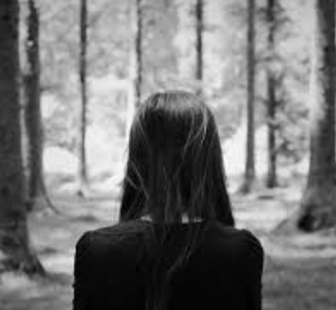
The images that i have chosen all show the backs of a persons head. This is to think about perspective and positioning in photography. Commonly, in back of head portraits the background is blurred, this is so that the person looking at the photo can see that the background is not important in this setting of photo. This helps the photographer get across the main effect of the image.


In this image the back of head portrait has been placed against a busy background to give it sense of scenery and is able to allow the choice of clothing to sit in with the theme.


In the two images above the simple backgrounds highlights the simplicity of the back of head portrait. In this image there is nothing to distract people and they can easily see the type of hair of the people.

In this image the angle of the head in the photo allows you to see some more of the face and head, this gives a different perspective to the photo. This make the focus also look towards the face with the back not being the most important part.


In this image the use of tone helps to make the back of head be the simple focus of the image. The one colour shows the back of the head fitting in to the scenery without questioning the actual place and the style of the person.


In this image the plain background helps to focus on the back of the head which highlights the focus onto the hair. The focus on the hair allows for a difference in perspective and can show some of a persons identity without seeing their face.


Sunday, 19 October 2014

Image bank - portraiture


Image bank - portraiture


I have chosen the images below to represent portraiture, these pictures range from studio portraits and black and white portraits. Each of these pictures can show a different style and mood in there photos.
In this image the portrait is effective because you can see a clear headshot of a person. You can see all the features of the person in the image, and the frame is adapted to be the right size for that person. In this picture you can clearly see who the photo is of, and the use of colour helps to enhance different features on their face.


In these two images the clear use of colour allows you to see the natural colourings in the peoples faces, this helps you to see a persons individual features. The colour also helps to highlight whatever emotion is being expressed and make it appear more natural on the face.


The first 3 images that i have chosen all have colour in them and you are able to clearly see the features of the person and a true representation of what they look like. The first images and a simple  portrait and you are able to clearly see who the person is, the use of editing has give the image a more unnatural effect which gives the image some originality. The second and third images have been left to show simplicity in the photos, if their is any editing in these two pictures it has been kept at a minimum so that the picture its self can give off the desired effect.


In the first image the use of tone allows the dark hair to be a major focus of the image. This draws in attention to be focused on this part of the image. The use of tone is also able to highlight the eyes in this image by making the black standout even more making the eyes become a prominent feature.


In these two images the use of tone is able to balance out the image and make it become completely focused on the emotions in the photo. In these images two different emotions are being shown yet the same effect can be used to highlight these different emotions.


The second 3 images that i have chosen have all been edited in black and white, this gives the images a more serious look the them. The first image has been edited in that way so that the picture is give a more dark and mysterious look to it, I personally think that this has been achieved. The second two images are not as serious but they still have that tone to them, the main effect of the black and white is that you can see a clearer focus on the image and it allows you to view it differently.


Tuesday, 14 October 2014

Image bank - shape


Image bank - shape  

Below are images that represent shape. they do this by showing the out line of an object. the pictures that i have chosen show how common shape is as some of the pictures are in realistic settings while others are not as common. The pictures below also show how some shapes can be made up from a collection of shapes to make up one big shape. As a whole the shape in the pictures help to give certain aspects definition and help to centre where you should be looking in the picture.

In this image the use of form and tone have been used to create a shape. This is effective as it is a creative way of showing a shape that clearly standout. The use of tone in this image helps to make the outline of the shape be clear and the angle of the photo makes the shape of the ring and the heart look 3D.


Above and below the a circle is shown clearly through the use of shape. In the image above a black outline allows the shape to standout in the photo. Also the blurred background means it stands out even more. The use of shape is clear here as the shape is easily identified and is made to be the main focus of the image. In the image below shape is show in a photo of multiple tubes. In the image the tubes are placed at different distances from the camera. By doing this you can get a clear view of multiple circles at the ends of the tubes. The one closet to the camera stands out more than others making this shape appear bigger than the others.


In this photo shape is shown through the positioning of a leaf stem. The leaf stem makes a out line of a heart shape, this creates the shape that is photographed in this image. This is a effective way of showing  shape as the shape is clearly identified, but in a simplistic way.


In these  two images the use of colour helps to make the shapes stand out. In the image about, each individual colour helps each section of the shape standout The single colours make the heart shape appear clearer to the human eye. The use of the pink colour with the light in the image below makes the heart shape look effortless. The shape is highlighted by the light in the middle making the colour standout even more.


Saturday, 11 October 2014

Image bank - texture

Image bank - texture:


The photos below show texture. Each of the pictures show a completely different style of texture which shows that texture is not always the same thing. From looking at these pictures I have noticed that it quite hard to duplicate the texture to get the same patter as most textures are natural and cannot be made to be the exact same. The pictures below show the variety in texture and also how it is man made and natural. The texture in photography allows for more details to be expressed in a photo, it allows it to come away from the completely 2D feel and allows for a little bit of edge.

In this image the use of tone helps to make the the cracks in the surface standout. This is effective because each individual crack is noticeable and they all standout together to portray the texture of the surface. The tone enhances the cracks and gives them a 3D feel which makes it look as if some on on  different levels.

The use of colour in this image helps to give a true representation of the object. The close up of the image helps to clearly show what the texture is almost making it look as if you could actually be able to feel the object.

The use of a close up in this image makes the rope in the image look 3D and makes it standout. In this image each individual line within the rope standout making up the texture of the image.

In this image the use of tone enhances the texture. The tone highlights each  individual line and aspect of the weaving. This helps to get a idea of what type of texture the image would have. The angle of this  photo also helps to get a feel for the texture of the image if you was close to it as well as far away.


In these two images the use of colour helps to show the texture. The use of different shades of colour, help to show the different line breaks and parts of each aspect of the photo. This is effective because you can clearly see the build up of the photo and the object. You can also see the aspects of the photo singularly as well as a whole.


Thursday, 9 October 2014

Image bank - Photo joiner


Image bank - Photo joiner


The pictures that i have chosen show the effect that Photo joiner and how it typically works. in the pictures i have chose photo joiner has been used to alter different types of images suck as natural landscapes and a persons face. This type of editing works all most types of picture as it helps to give the image a different feel without it looking boring in its original form.


In the first image photo joiner has been used to show a natural scene. This is effective as you can clearly see multiple different photos that make up this scene. However The outline of this image has been left tot be completely straight, and the overall image doesn't really look distorted and almost sticks to its original form.


In these two images the photo joiner has effectively been used to make up a image. In the first image its making up a persons face. This is effective as you can clearly see all elements of the face and how the person looks. However this image could be more effective if it had come away from the original more. An example of this would to have different parts of the eyes or lips and different levels so they didn't join up completely. In the image below photo joiner is successfully creating a building.the overall image is effective as the building is clearly portrayed. However the image as a whole could improve if the building wasn't completely lined up to be a copy of the original. 


In these two images photo joiner is again successfully used. In these images there a has been some adaptation from the normal by making slight changes to the lining of the image. In these images the photo joiner is clear  and stands out. This is effective as its and original way of using photography as it is more fun and is a abstract way of showing images.


The image below is an effective use of photo joiner as you can clearly see a distortion to the original. In this image its a lot harder to tell what the original image was.  None of the lines in this image completely line up which adds to the effectiveness and originality of the image.


Sunday, 5 October 2014

Image bank - Movement

Image bank - movement:


This picture shows movement clearly as there is the blurring of the train. The fact that you need to see the surroundings to be able to completely tell what the image is makes you able to see how fast the train is actually moving.


This picture shows movement as we can see that the tress around have been blurred highlighting the fact that movement is taking place in this picture. This picture is a picture that typically shows movement as it is a rather simple way of it being shown to someone.


This picture has been used to show how busy London streets can be. the blurring of the bus has been used to show movement on the streets of London. I think that the purpose of this picture was achieved as you can clearly see signs of movement and it being busy.


This picture shows movement in a more simple way as they have left the picture in the middle with a back ground around it. this picture shows movement without a background or setting being involved. this picture shows movement where nature and weather are involved as it shows that the movement has been made because of the wind.