Showing posts with label contrast. Show all posts

Thursday, 11 December 2014

Definition post - Contrast

Definition post - Contrast:


Dictionary definition:the state of being strikingly different from something else in juxtaposition or close association.


Describing words:Comparison, contradiction, disagreement, variation, opposite.


I have chosen these pictures from the internet as i feel they all show different types of contrast however the same kind of effect is given off. I think these pictures as i feel that all the pictures show contrast in a simple way by not having harsh or clearly shown differences  between the two different aspects of the photo. I think that these pictures are a good style of contrast to look at when looking at contrast as its a good way of showing how common contrast can be in photography.


My definition: Contrast is a distinctive difference or opposite between different things for example the contrast between male and female. 

Wednesday, 10 December 2014

Contrast location 2 - work diary

Contrast location 2 - Work diary:

In this session we was given the task to re-shoot contrast on location. I found this session to be be quite boring and found myself repeating images from my previous contrast location shoot. While shooting this topic I attempted to find some more original and different shoots than I had already taken, I found that while I had taken a few shots that were different these were limited as I was trying to not repeat the same shots. After shooting the topic of contrast twice now I have decided that I have finished with the topic and don't feel that I need to shoot it again.


The two pictures above and below are two of my examples of contrast. The image above shows a clear contrast between colours as well as the tiles and the grass. I have chosen this picture because I like the clear use of colour in this image as well as the clear difference between the two. I have chosen the image below because of the clear difference between the bricks and the stones, this contrast is a different contrast to any that I have photographed before as I have focused on something else other than colour. I think that this is a clear example of the different types of contrasts that can be photographed.


I have included these two pictures from the internet to show contrast on location. The image above is a clear contrast between colours as well as the grass with the soil. I have included this image to show how contrast can be found with all different settings and with natural elements. I have included the picture below because it shows a contrast between something that is natural and something that is man made.


Tuesday, 9 December 2014

contrast location 1 - work diary

Contrast location - work diary:

In this session we were shooting contrast while on location. I enjoyed this topic as i found it easy to find different contrasts while walking around campus. I found myself taking a large number of images as well as having a variety of different contrasts. I also found myself thinking of more original contrasts meaning that i didn't find myself getting bored. I wouldn't re do this topic as i was happy with the work that i had produced, and found that i had enough without needing to re shoot. I think that in this session some of my best images were produced as i found my self coming up with original ideas as well as ideas that fit the topic. 


These two pictures are two of my examples of contrast. The picture above is showing a contrast in the sky that was completely natural. I think that this is one of my best pictures for showing contrast because it is completely different to any of the other pictures that i had taken. I also like how natural the contrast is and that the picture has been left without to much editing. The picture below is a more common contrast as it is a contrast between the colour of two sets of bricks. I have chosen to include this picture because i think that it shows that although it is a common contrast it is still a very clear and one of my best ways of showing contrast in photography. It also shows how simple a contrast can be and doesn't have to be over complicated.


In these two images contrast is being shown. I have chosen the first image because of the similarity between it and  my image of the sky. I have included this to show what I based my idea off of. I have also included this to show how its a natural occurrence as its not something that i have thought of my self. i have also chosen this picture to show that contrasts don't always rely on a personal touch as well as something growing, in the case i was lucky to take my picture when i did as i would not always be able to find a sky like that. I have chosen the picture below because it shows how clear a contrast can be even if it is not natural. This is clear as you can tell that someone has placed the shoes on the grass. In this image the contrast can clearly be the difference in the colours as well as the idea of something man made being placed on a natural setting.


Thursday, 4 December 2014

Work diary - Studio contrast 2

Work diary studio contrast 2:

In today's session we were in the studio shooting contrast again. The second time around I found myself improving the quality of my images and thinking more about the contrasts and the composition. However I found myself running out of ideas quite quickly and then saw myself retaking images that I had I already taken in the previous session. If I could re do this topic i would spend more time thinking about what the contrasts are in my images so that I don't end up repeating what I am shooting.


I have included the picture above because I think it is an example of a common contrast as this is a contrast between clothes. I think this image shows the clear differences in the clothing that the 3 people are wearing, however I don't think that this is a good image for contrast as I don't think they are as clear as they should be. I don't think that when a person saw this picture they would think that it isn showing contrast.


I have chosen this image because I think the clear contrast between the shoe laces. This picture is not always something that you would see as most people would commonly wear laces of the same colour. If I was to re take this picture would try to think more carefully about the composition. 


I have chosen this image from the internet because it shows how contrast can happen when someone has altered some objects to create a contrast. I also like how strong the colour contrast is. From looking at this image I will try to use the idea of strong colours to improve my work further.


I have chosen this image from the internet to how how a contrast can happen naturally and is not always man made. This picture has made me want to think about contrasts more and look for contrasts that I see while being out.

Wednesday, 3 December 2014

Contrast - Image bank

Contrast - Image bank

Below are images that I have found from the internet that express contrast in photography. I think that these photos all show how basic contrast can be and how it can be found in a variety of settings that we can always see around us.
I also think that these photos show how contrast can appear more than once in one place and doesn't always have to be a contrast between colours. These pictures also show how contrast can appear naturally or they can be put together in a scene.

In this image the use of contrast is not directly compared. The contrast is still clearly visible but is not split by half of the image, the two different things being compared are found in their natural setting. The colour difference is the main difference in this photo, and is one of the first things that is noticed as the red standouts in the green setting.


The contrast in this image is the nature of the flower along side the living butterfly. Both of them standout against each other as they are prominent with their separate features. The blurred background also helps to show this contrast as the background is make less important so the contrast can standout even more.


In these two images the main contrast is the colours. These images are effective as the different sections haven't just been placed next to each other and photographed, they have been left in their natural settings so they look as realistic as possible.


In this image the use of tone is used to create a contrast. The white is compared to the black background, the black helps to highlight the white. However the two colours sit well together to show a colour difference that is clearly noticeable.


In this image the two parts of the image that are showing the contrast have been placed next to each other, and the two parts are directly compared in this image. This is effective because the contrast is easily noticed and people can see the contrast naturally.

Wednesday, 5 November 2014

Work diary - studio contrast


Work diary - Contrast:

In this session our task was to go into the studio in groups and shoot different contrasts that we could show with people. I personally enjoyed this task as I enjoyed getting to work in a group as I found it made the task more chilled and allowed us to work together to think of ideas. However I also found this task slightly difficult as I didn't want to copy all the same ideas as everyone in my group which meant that I didn't find myself with enough pictures to work with at the end of the session. From this I have decided that I will re-shoot this topic so that I can improve some of my images as well as giving myself more to work with.


I think that the picture above and the picture below are my best pictures as I like that in both pictures I have been able to photograph to kinds of contrasts. In the top picture I have show the the contrast between Dylan and Frankie's height, as well as showing the contrast between boy and girl. Another thing I like about this picture is that both of these contrast show quite obvious contrasts. Also while editing this picture I noticed that Frankie is looking at the camera while Dylan is not, I think that this is a unintentional contrast that has occurred while I was taking the picture.


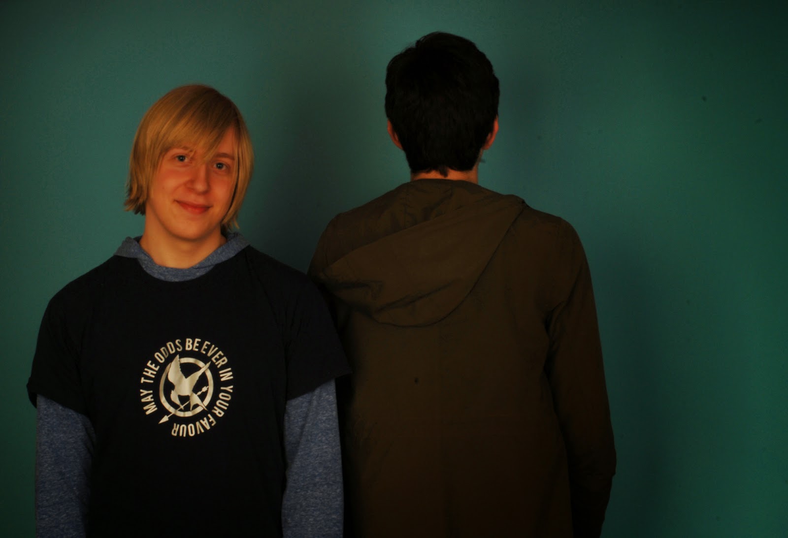
I think that this picture is also one of my best as again it shows to different types of contrast in one photo. In this picture there is a contrast of facing to different ways as well as the contrast of the different hair colours. I like this picture as I think its effective at showing how simple contrasts can be in photography.


I have chosen these two pictures from the internet as I think that they show two of the most common types of contrasts that can show how effective the contrasts can be. The top picture shows the simple black and white contrast can be and still have a big impact on the way the image is shown. The picture below shows how colour in contrast can help to highlight different aspects of the image as well as let them blend in to the picture.