Showing posts with label colour. Show all posts

Tuesday, 16 September 2014

image bank - colour


Image bank:

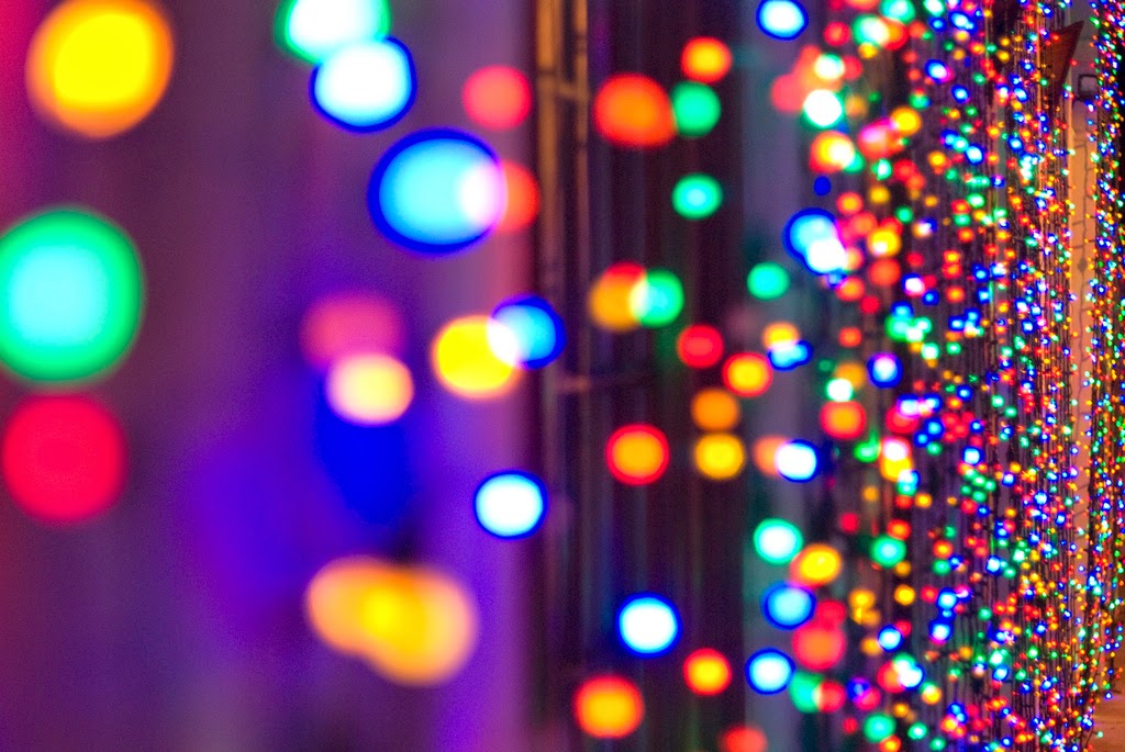
I have chosen these photos because I think they show the range in effects that colour can have on a image. Personally I think that colour makes an image more interesting and fun to look at. Colour can transform a mood of a person or picture. Colour can also make a particular part of a picture stand out more than others. These images show the full effect colour can have on a image by showing the effect colours have when put next to or around others colours as well as the effect the colour can have when left on its own against a plain background.


In the image above the use of multiple colours together makes the how image standout, all of the colours having merged together means that none of the colours are singled out yet none of them go unnoticed. The use of this formal element here if fun and vibrant,and feels the whole frame. There doesn't appear to be a meaning behind the image and therefore the whole this able to remain fun.


In the image below and orange has been placed against a white background. In doing so the plain white background allows for the the colour orange to standout in quite a clear and vibrant way. This also allows the majority of the surface of the orange to appear in the image. The small amount of green in the photo gives a small break to the colour orange. The green also gives shape to the leaf and stem taking away some of the focus on the round orange.


In the image above the use of multiple colours against a background that using tone, mean that certain elements of a image standout more than others. In this case the use of bright colours for the telephone boxes make them stand out in what appears to be a dull and lifeless street. This gives a edge of fun and creativity to the image, especially since phone boxes are traditionally red and don't stand out as much as they do in this image.


In the two images above and below different colours have been used against each other. In the image above the idea of a colour wheel makes the image appear fun and creative. The different colours almost travel around the wheel to the next colour. When you look at the image you immediately follow to wheel round to look at all the colours singly and then together. In the image below different colour paints are photographed in different shaped and sized containers. This allows you to clearly look at all the colours, and allows them to all standout. The use of different sizes is effective because it feels all the gaps in the image, and puts a different colour to all the space in the photo.


In the image above different colours progress through a change across the front of a building. This is effective as the colours change as the building goes on making it look like a spectrum. The changes in colours all standout singly as well as together making the whole image look bright and vibrant. 

Definition post - colour


Definition post - colour 

Dictionary definition: an attribute of things that results from the light they reflect, transmit, or emit in so far as this light causes a visual sensation that depends on its wavelengths.

Describing words: bright, vibrant, eye catching, bold, tint, undertone, light. 


I chose this photo because it shows the effect that colour has. Personally I think that the colour in this photo changes the mood, without the little burst of colour I think this picture would look boring and dull. I also think this photo shows the effect colour can have on a picture. 


I chose this photo as I think it shows how colour appears in natural environments. I think it shows how important colour is natural settings and everyday things.


I chose to include this picture because I think it shows how light effects the colour. I think it shows how light alters a picture, although its not changing the colours in the pictures, the light bounces on the dice and makes parts stand out more than others.


i chose this picture because it shows the colour in the background, and also the colour of the shoes. The colour in the background stands out where the light has hit the parts of the grass . Tthe brightness of the blue shoes against the white laces stands out because of the contrast of the two colours.


My definition: colour is a way that we identify the differences in things.

Monday, 15 September 2014

work diary - colour


Work diary - colour:

In this session we had to go out and take pictures of anything that had colour in it. I found this task easy as everything that I looked at had colour in it. I found that I could find combinations of colours in a lot of my pictures which helped to vary my pictures. For me personally i found this session to be quite boring as i found that i was just photographing more or less the same thing. If i was to re do this top i would try to find different ways of showing colour as well as more exciting colours to photographs.

Progression: If I was to do this session again I would focus more on finding more interesting objects to photograph colour. I think that I could use colour in a more exciting and interesting way by finding ways to make the colour completely change the theme or emotion of the picture. One of the ways that I would possibly use colour would be in a natural setting so that I can show colour in the most natural setting possible and show how much of an impact it can have on a image. An example of this is the picture below as the bright yellow colour is used to show the difference between the two shades of green.


I think that both the picture above and the picture below are my best pictures for this topic. I think the picture above is a good picture because the bright vibrant colour of pink, contrasts with the dull grey colour. I also like this picture because of the angle I've taken it at meaning that you can't exactly tell what this picture is of so you can just focus on the colours. I think that the picture below is also one of my best as its got different colours in the backgrounds and in the main part of the picture. I also like the balloons as they add a nice little burst of colour to the picture. Also because the picture is blurred you again cant tell what the picture is of meaning you just focus on the colours.


If i could re-do this topic I would try to find different contrasts of colour together. I would also think about the positioning of my photos so that the background or other parts of the shot are not distracting from the colour in the photos.


I have chosen to include these photos from the Internet to show the difference between a photo with lots of colour and a photo in black and white. personally I prefer the photo of the colour as I think its nicer to look at and it also stands out more. I also think this photo shows more energy where as the photo below looks more dull to me. I chose to include the picture below as its still using colour, however its used in a different way. I think this photo is less interesting to look and generally doesn't stand out to me.