Showing posts with label Connecting essay. Show all posts

Monday, 15 December 2014

Connecting essay 5

Connecting essay 5: 


The image above is a photo joiner of a building. It is clear that each section of the building has been made from a number of images and these images have not been put in an exact space which is straight and perfectly lined. This example shows how photo joiners can be used to make an image more original and standout from how it usually looks. 


Above is my example of a photo joiner, and I have also chosen to use a building to make up my image. In my image I have used a lot more images to build up my photo joiner which allows for a different effect to the one i used as an example. The example image is a lot easier to tell what the image is of because of the use or larger images. My image for example is a lot busier and it hard to see each part of the image. However my image has used a lot more images which gives it a accurate idea of the image being a photo joiner.

One connection between the two images is the obvious use of multiple images to build up the photo joiner. Another connection between these two images is the image building up to a image of a building to show all the different aspects of the building. The main difference between the two images is the size of the photos in the photo joiner. In my image i used smaller images that were more precise to show more detail in these images. The effect of this meat that there was more images included in my photo joiner, as well as being more precise in the detail that were shown.

Connecting essay 4

Connecting essay 4:


In the image above it is clear that the photographer took their to to think that the composition of the photo and the positioning of the camera. For this reason you can see that the sun is shinning more on the right side of the image than on the left side. This allows for a difference in colour in the image as well seeing some parts of the image clearer than the others. There is also a bright clear sky in this picture which is able to fit nicely into the image without being bold or to subtle.


The image above is my own image which i think is pretty similar to the first image. In my image the sun is shinning on to the left side instead of the right side. The effect of this allows for again a difference in colour and also allows for the image to move into the darkness of the other side. The blue in the sky allows for a contrast in the colours but is not to subtle to be ignored or not to bold to be distracting.


One of the biggest connections between these two images is the use of the sun light that changes some of the colour as well as move the image in to the distance. Another connection between these two images is the use of journey showing how the image moves on into the distance.

Thursday, 11 December 2014

Connecting essay 3

Connecting essay 3:


This is one of Mapplethorpe's portraiture, this is a clear example of the style that his shoots are taken. In this photo it is clear that Mapplethorpe has thought about his composition so that the person is in the middle of the the frame. He also changes the colour of his prints to black and white which helps his images to have a different tone. Mapplethorpe shows his complete control over how is final image will look and this is clear in the way that the model is perfectly styled for the image and the expression she was told to have. By doing this Mapplethorpe is able to show his originality and control over his images and is able to make it different for the time his images were produced.


Above is my example of a Mapplethorpe portrait. I have attempted to style my shoot as close to Mapplethorpe's as possible by thinking about how I wanted Lauren to sit, what expression to have. It is clear that in my images i should have focused a little more on my composition as in my image Lauren is not in the middle of the frame nor is she sitting straight. In the image tone is used to give a more subtle feel to the image. The use of tone makes the image feel relaxed and by choosing to not use colour attention is not taken away from the model.

The clear that the biggest connection between the two is that the picture is taken in Mapplethorpe's style. Another connection between the two is the use of composition in the photo. This allows for a accurate and clean shot that doesn't have any distractions in the background.  The use of tone in both of the images makes the models fit into the frame in a relaxed way that looks natural instead of them looking out of place. The main difference in these photos in the use of composition, the effective use of this element in Mapplethorpe's image makes the model comfortably fit into the frame and the photo. The use of composition is lacking in my photo making the model almost look out of place and as it the image has bee n rushed and the composition hasn't even been considered.

Tuesday, 18 November 2014

Connecting essay 2

Connecting essay 2:


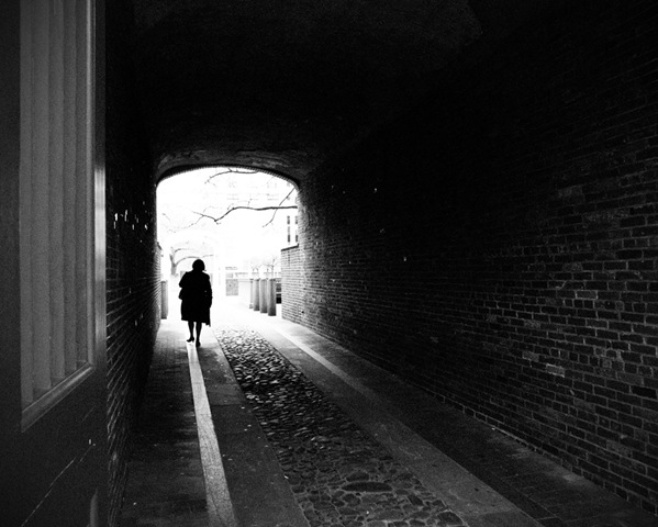
In this picture from the Internet a journey is being shown through the person walking through a tunnel. Through the use of tone, the photographer is able to create a certain mood in the photograph and is able to give it a deeper meaning without there necessarily being a meaning behind it. By doing this the photographer is able to allow everyone that sees the image to have their own opinion of what the photo is of. In this image the camera seems to be at a slight angle so that you can see the tunnel fully and see the whole width. The use of depth in this image makes the end of the tunnel stand out as well as with the use of the light making the end seem to be brighter than the beginning. The use of tone in this image gives the overall photo a dark and mysterious feel, as well allows the light at the end to stand out more.


In my picture i have show a person on a journey. I decided to keep my image in colour which can allow for the image not to necessarily be seen a deep or full of emotion and can just be seen as a person walking through a tunnel. In my picture I have also chosen to have quite a strong light and the end of the tunnel to highlight that there was where the end of the tunnel was, however the light can also be seen to have a deeper or second meaning. In this image the use of depth make it appear as if theres a end to the tunnel and to the journey. The light at the end of the image highlights the end of the tunnel, yet the path that continues around the corner shows the journey continuing on further.

In both of these images the tunnel is the key aspect of the image.  The tunnel represents  journey in both which is supported by the person in the image walking through the tunnel. The use of light in these images makes the end of the tunnel stand out in the image, but also adds light to the rest of the tunnel. Where these photos differ is that one uses tone, while the other uses colours. Both of these formal elements make the photos effective but in different ways. In the image with tone gives a more dark feel to the image, while the on with colour appears to be more positive and uplifting. 

Connecting essay 1

Connecting essay 1:

This is a picture that i found on the Internet showing autumn colour through a close up of the leaves. In this picture the main focus is on the 3 leaves in the centre of the image and the background is blurred. The photographer has decided to have a clear focus on the front leaves and allow for parts of some leaves to be included in the picture but not let them distract from the focus. This photographer has also decided to feel some of the gaps in the background with the sky allowing for a different colour to be included into the picture. The ago of this image allows for more leaves to be in the frame yet the 2 largest in the middle of the frame are the ones that standout and make up the picture.


This a picture that i have taken of a single leaf and is showing autumn colour. In my picture i have decided to include just one leaf as the focus but have multiple smaller leaves in the corners of my image that are blurred slightly. In my picture i have also decided to include some more twigs to include a slight variation of colour.  In my picture the use of the other smaller leaves and twigs make the leave sit it its natural setting so the picture is realistic. 

The connection between the two picture is essentially the fact that both pictures are showing autumn colours and is focusing on leaves. In both pictures there is a variety of different colours as well as a blurred background. The camera has been focused on the leaves in the image and has allowed for the background to fill up the rest of the frame, showing the use of autumn colours. In both of the images there is other aspects of the branch included but the have a been burred out slightly as they don't need to standout for the image. In both of the images the use of the formal element colour allows for some difference in the image so that one colour isn't over used making the image appear to be dull.